


Designing with Color-Blindness in Mind
Small learning series — powered by ChatGPT

Do you know someone who is color-blind?
Have you ever thought about how color-blind people experience the world?
My father was born color-blind. Growing up, he navigated life just fine — driving, crossing the street, choosing clothes. My cousin, when she was little, was fascinated by his condition. Every time she saw a color, she’d run to him and ask, “What color is this?” My father would grin and say, “Grey.” Every time. She was amazed. “Really? Everything’s grey?” Eventually, she grew out of it, but I never forgot the way he played along with a smirk.
I always assumed color blindness was rare, a quirky exception. That is, until recently.
Designing for Everyone: A Wake-Up Call
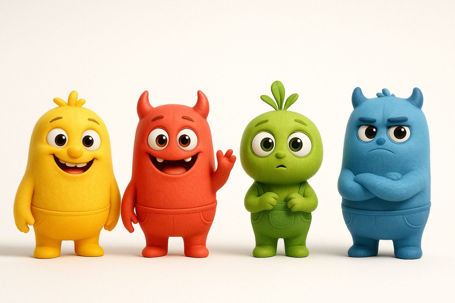
My colleague had a project that involved a lot of visual design. We were reviewing interface layouts, and someone on the team immediately pointed out, “Hold on, what about people who are color-blind?” It was a good question.
Thankfully, some design systems already include color-blind friendly palettes. It’s thoughtful, really. The colors we ended up choosing were from one such palette.
Out of curiosity, I asked my father what he saw in those colors.
His answers were slightly different than mine, but each color was distinguishable to him. Which is exactly the point.
A ChatGPT-Fueled Deep Dive
That sparked my curiosity. With AI at my fingertips, I thought:
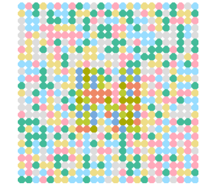
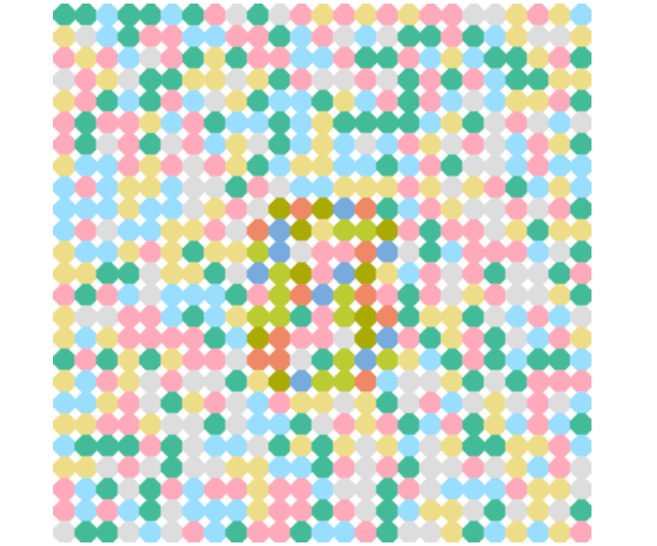
Can ChatGPT help me visualize how these colors appear to different eyes? Maybe even generate some fun color tests like those Ishihara plates — the ones with numbers hidden in dots of color?
Within less than an hour, I had generated:
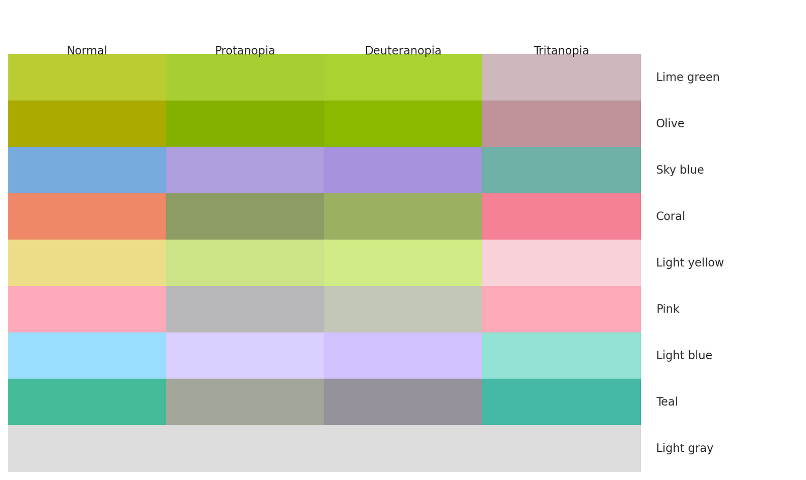
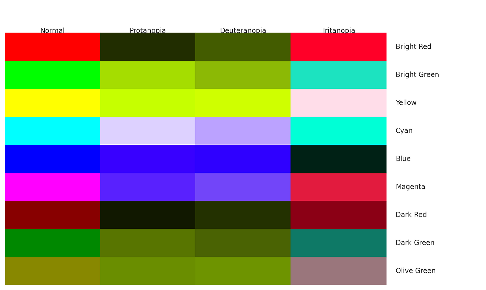
Several color simulations (normal vision vs. red-green and blue-yellow deficiencies)
Ishihara-style dot patterns
A deeper understanding of what makes a color friendly or unfriendly for color-blind users
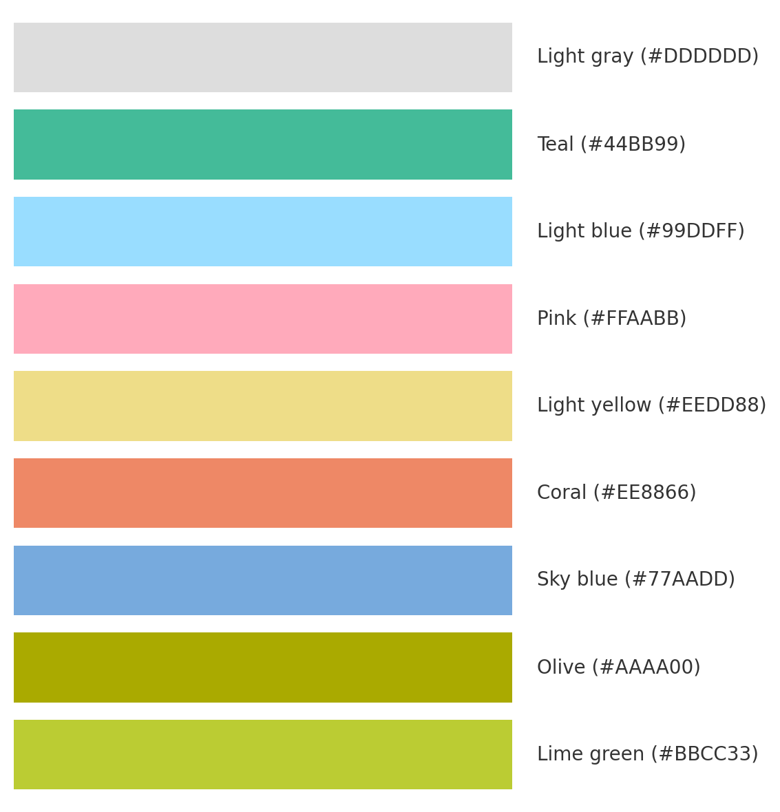
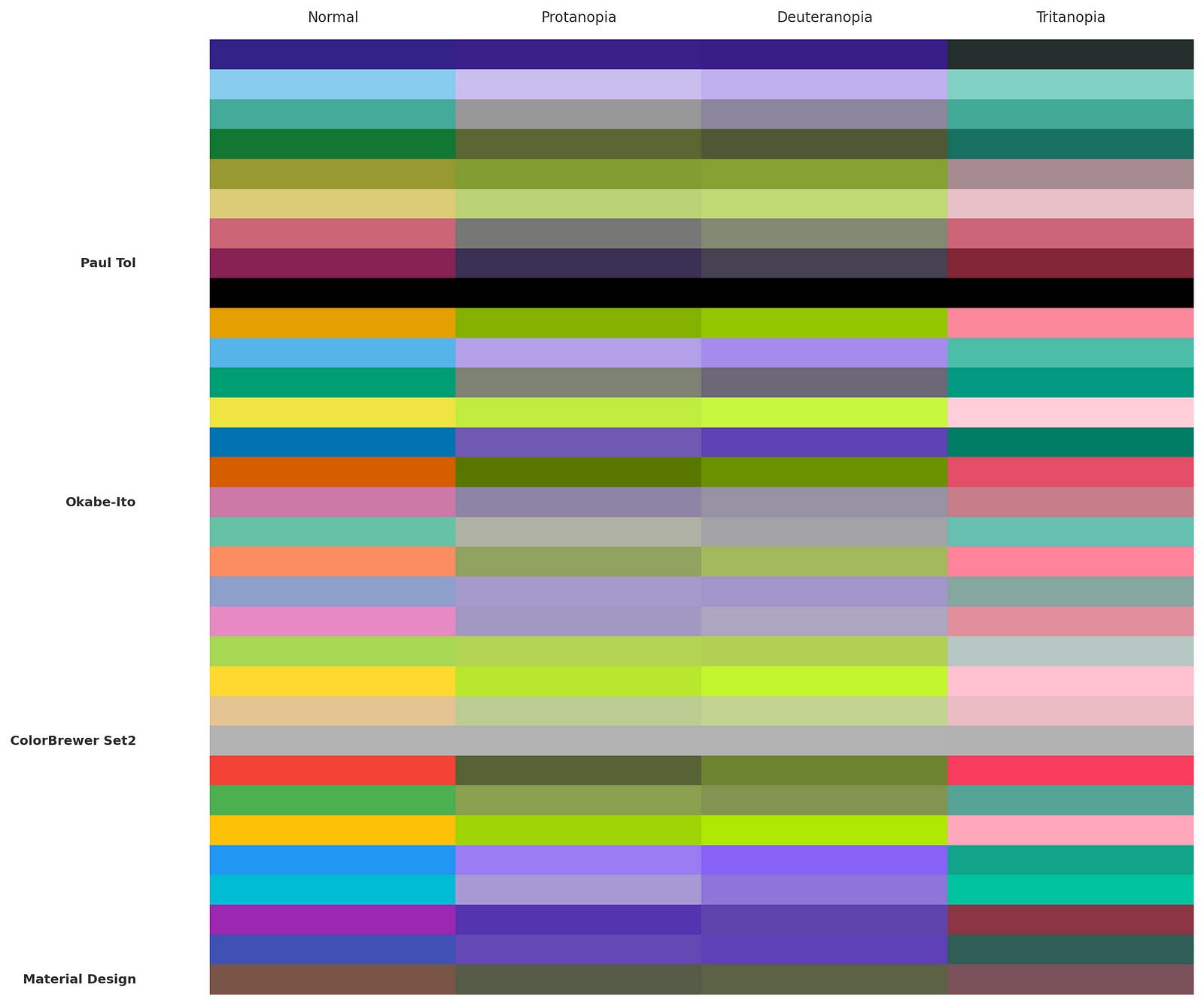
Side-by-side charts showing how the exact same palette changes across different types of vision
I even shared the test images with my father. Some that looked ambiguous to me were instantly readable to him. Fascinating!
So… What Makes a Color Friendly?
I learned that color-blind friendly palettes aren’t just about avoiding red and green. They’re designed to:
Use hues that don’t collapse into each other for different types of vision
Maintain luminance contrast (difference in brightness)
Avoid certain color pairings (like red/green, blue/purple, or green/brown)
So apart from what we’ve chosen for our project, there are four well-known palettes, all scientifically designed:
Paul Tol’s Palette — Known for muted but distinct colors, great for print and data viz.
Okabe-Ito Palette — Especially effective for scientific plotting (used in R
ggplot2)ColorBrewer Set2 — Popular in cartography and infographic design.
Material Design Subset — Pulled from Google’s design system, this subset avoids problematic pairs.
On the flip side, I also learned what not to use — colors that might look totally different to someone like my father, or worse, completely indistinguishable.
Design That Works for Everyone
This one-hour session with ChatGPT became a surprisingly deep dive into accessibility, color theory, and inclusive design. I came away not only better informed — but inspired.
Here’s what I’m taking into my future projects:
Use muted but distinct colors that work across vision types.
Avoid relying solely on color to convey meaning — use icons, labels, shapes, and patterns too.
Design for the edges of the spectrum — because when you make your design accessible, you make it better for everyone.
A Final Thought
Even if you’re not color-blind, you might still prefer those softer, less saturated tones — they’re easier on the eyes, more calming to the brain. Turns out, my personal taste for gentle palettes actually aligns with science. Who knew?
And maybe that’s the real takeaway:
Don’t assume others are “abnormal” just because they experience the world differently. We’re all a little different — and that’s exactly what good design should embrace.
PS: A Little Learning Log
If you’ve been following my writing, you probably know about my ongoing GenAI 30-Project Challenge, where I explore how to turn AI-powered ideas into real, working products.
But not everything has to be code.
I’m carving out a little series to document these short, curious learning moments with ChatGPT — no coding required.
Yes, AI supercharges my work as a programmer. It helps me build apps faster than ever. But more importantly, it sparks thoughts, inspires learning, and opens doors I didn’t even know existed.
Sometimes, the biggest boost isn’t in productivity — It’s in perspective.
See you next time,
Jenny
Woah these ChatGPT colorblind simulations are cool
I loved this article! I will definitely keep the concept of inclusive design in mind for my future projects. I also appreciated your use of AI to facilitate learning—it's a great example of how AI can be a growth accelerator for developers like us. 👏